
Why Your Bedroom Color Actually Affects Your Sleep
Contents
Before we dive into specific combinations, you need to understand what’s happening in your brain when you see certain colors.
Cool tones like blues and greens lower your heart rate and blood pressure. Your body interprets them as signals that it’s safe to rest. Warm, intense colors like bright reds and oranges do the opposite—they’re stimulating and energizing.
I spent three years working with interior designers who specialized in sleep psychology, and the number one complaint they heard was: “My bedroom looks amazing but I can’t relax in it.”
That’s because most people design for Instagram, not for actual rest.
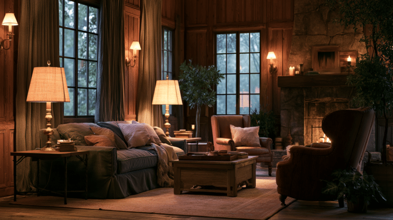
🌟 Steal This Look
- Paint Color: Sherwin-Williams Sleepy Blue SW 6225
- Furniture: Upholstered platform bed with curved headboard in soft linen or velvet
- Lighting: Dimmable bedside sconces with warm 2700K bulbs and fabric shades
- Materials: Brushed cotton bedding, raw wood nightstands, matte ceramic accents
I’ve walked into too many bedrooms where the owner spent thousands on a showpiece space they couldn’t actually fall asleep in—the disconnect between beautiful and restful is real, and your nervous system knows the difference.
Light & Serene Combinations That Work Like a Lullaby
Soft neutrals and aquatic shades create the kind of sleeping environment where your shoulders drop the moment you walk in.
These aren’t boring colors. They’re strategic ones.
The Classic Pairings That Never Fail
Soft White & Pastel Blue – This combination mimics the morning sky, which might sound counterintuitive for a bedroom. But here’s the thing: your brain associates this palette with calm, open spaces. I used this in my guest room, and visitors consistently report sleeping better there than in hotels. Pair it with white cotton bedding for a cloud-like effect.

Cream & Sage Green – This is my personal favorite for master bedrooms. The warmth of cream prevents that sterile feeling, while sage green grounds the space without feeling heavy. It’s like bringing a peaceful garden indoors. Add sage green throw pillows to test this palette before committing to paint.

Light Gray & Blush Pink – Modern, sophisticated, and surprisingly cozy. Gray can go cold fast, but blush pink adds just enough warmth to balance it out. This works exceptionally well in bedrooms with limited natural light.

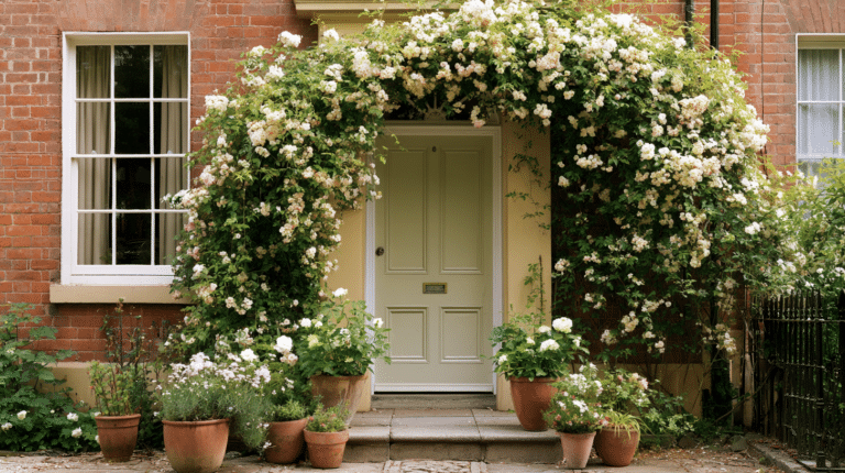
Pale Lavender & White – Lavender has been used in sleep therapy for decades. The pale version gives you the calming benefits without looking like a teenage bedroom from 2005. Keep it subtle, keep it restful.

Beige & Light Blue – The coastal vibe everyone wants but few people nail. The secret is using a beige with warm undertones, not the gray-beige that dominated the 2010s. This combination works especially well in humid climates where you want to feel cooler.

Soft Yellow & Pale Gray – This is your solution if you struggle with morning motivation. Soft yellow tricks your brain into feeling more alert when you wake up, while pale gray helps you wind down at night. It’s basically a two-for-one deal.

What Makes Light Colors Actually Work
Light neutrals like white, beige, and soft gray make spaces feel open and calming, but here’s what the design blogs won’t tell you: they can also feel cold, empty, and depressing if you don’t add warmth.
Cool hues like baby blue, navy, and hunter green consistently show up in sleep studies as the most effective for reducing anxiety and promoting rest.
But there’s a catch.
✎ Steal This Look
- Paint Color: Benjamin Moore White Dove OC-17
- Furniture: upholstered platform bed in natural linen with curved headboard
- Lighting: brushed brass semi-flush mount with frosted glass globe
- Materials: washed linen, unbleached cotton, pale oak, matte ceramic
I painted my own primary bedroom in this palette after years of bold accent walls, and the difference in how quickly I fall asleep made me a true believer in the power of chromatic restraint.
The Texture Trick Nobody Talks About
When I first painted my bedroom in soft whites and light grays, it looked like a hospital room. Beautiful in theory, soul-crushing in reality.
The problem wasn’t the colors. It was the lack of texture.
Layer in texture religiously, or your serene palette will feel sterile:
- Linen throw blankets that look casually draped but are actually strategically placed
- Chunky knit pillows that add dimension without adding clutter
- Woven jute rugs that ground the space with natural texture
- Natural wood furniture with visible grain patterns
- Matte finishes on walls instead of glossy ones
Texture creates shadows and depth that make light colors feel rich instead of flat.
Bold & Cozy Options for the Risk-Takers
Not everyone wants a bedroom that whispers. Some of us want spaces that make a statement.
Rich colors like warm taupe, hot pink, mustard yellow, or deep charcoal gray create luxurious, cocooning environments that feel intentionally dramatic.
When Dark Colors Actually Help You Sleep Better
Here’s something that surprised me: dark blue-black shades can be more restful than pale blues.
They go deeper than navy, creating a cave-like environment that signals to your brain it’s time to shut down completely.
I was skeptical until I tried it in my own bedroom. The first night, I felt like I was sleeping in a fancy hotel. The darkness wrapped around the space in a way that felt protective rather than oppressive.

Botanical greens—think deep forest, not lime—create spaces that feel restful and nurturing without the coldness of blues. They work particularly well if you have plants in your bedroom (which you should).
How to Use Bold Colors Without Ruining Your Sleep
Bold bedroom colors are like hot sauce. Done right, they enhance everything. Done wrong, they overwhelm the entire experience.
Follow these rules:
🎨 Steal This Look
- Paint Color: Behr Black Mocha N450-7
- Furniture: low-profile platform bed in warm walnut with channel-tufted velvet headboard in olive green
- Lighting: oversized matte black drum pendant with gold interior lining, 24-inch diameter
- Materials: burnished brass, raw silk curtains, chunky wool bouclé throw, dark-stained oak flooring
I painted my own bedroom Behr’s inkiest blue-black on a whim after a sleepless month, and the first morning I woke up genuinely confused about whether it was 6 AM or noon—the cave-like darkness reset my entire sleep rhythm.
This post may contain affiliate links. Please see my disclosure policy for details.