

Spring Living Room Decor: How to Bring Fresh Energy Into Your Space Without Looking Like Easter Exploded
Contents
Spring living room decor combines soft, fresh color palettes with nature-inspired accents to create a light, rejuvenating space.
I’ll be honest—I used to think spring decorating meant cramming pastel everything into my living room like some kind of Pinterest-obsessed bunny.
Wrong.
Dead wrong.
After years of trial and error (and one particularly regrettable incident involving neon yellow pillows that made my husband’s eye twitch), I’ve finally cracked the code on spring decor that actually looks sophisticated instead of saccharine.
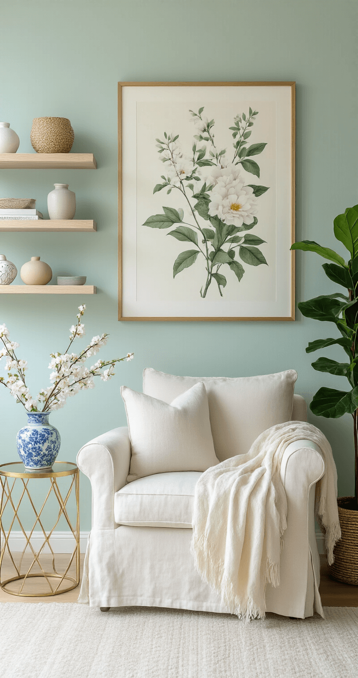
★ Steal This Look
- Paint Color: Sherwin-Williams Sea Salt SW 6204
- Furniture: slipcovered linen sofa in a natural oatmeal tone with clean, modern lines
- Lighting: rattan pendant light with an organic, woven texture
- Materials: raw wood, unbleached linen, matte ceramic, and weathered brass
I learned this the hard way after my neon yellow pillow disaster—now I always test colors in morning light before committing, because what feels ‘fresh’ at 2 PM can feel frantic at 7 AM.
👑 Get The Look
Why Most People Get Spring Colors Completely Wrong
Here’s the thing nobody tells you: spring isn’t just about pastel vomit.
It’s about fresh, rejuvenating energy that makes your space feel lighter without looking like a nursery.
The secret?
Strategic color placement instead of going full Peeps candy store.
The Soft Pastel Foundation That Actually Works
Soft pastels form the backbone of spring design, but you’ve got to know which ones to use.
The winners in my book:
- Lavender – calming without being boring
- Baby blue – airy and spacious-feeling
- Light yellow – sunny without screaming at you
- Mint green – fresh like morning dew on grass
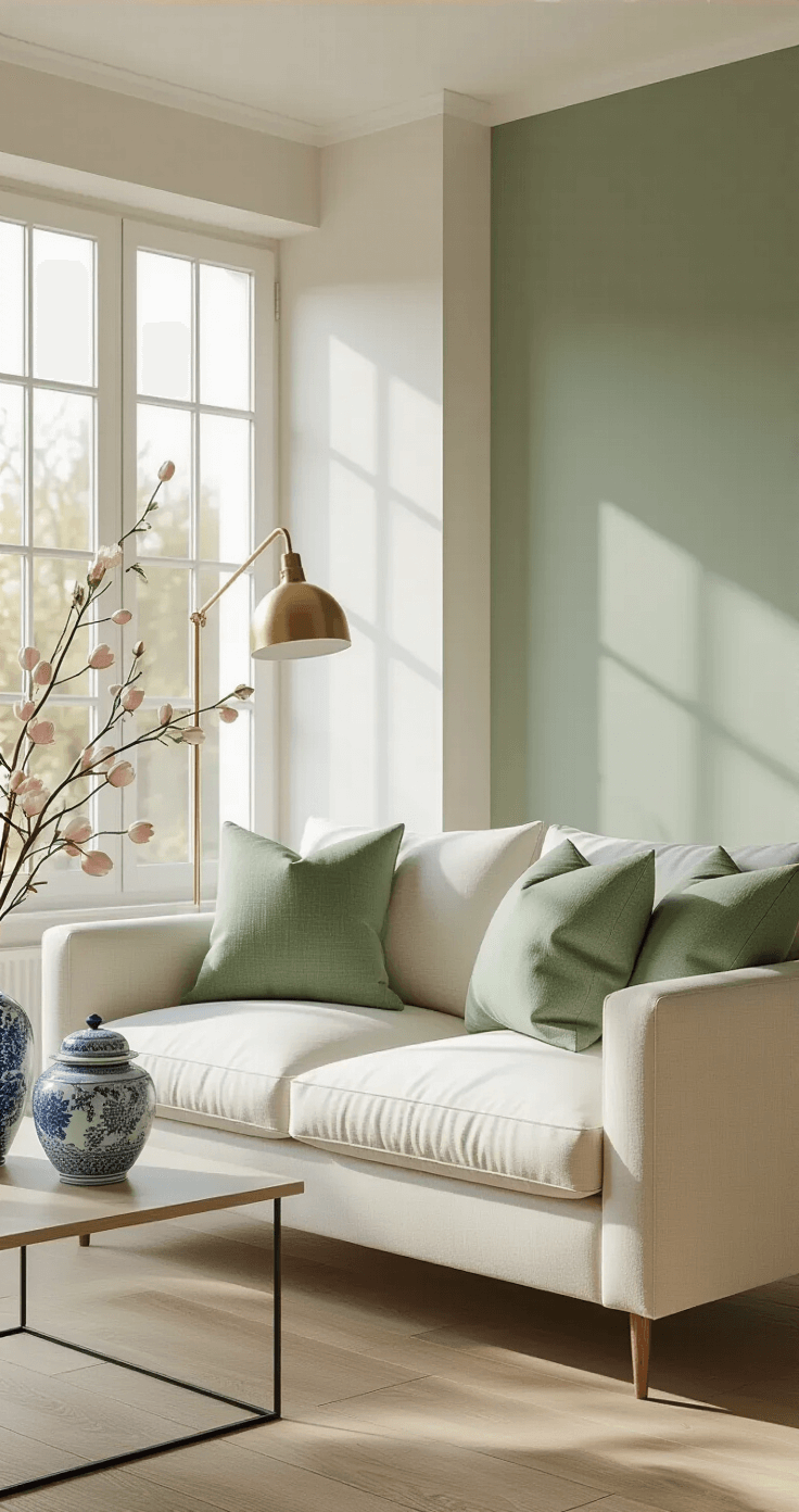
But here’s my personal favorite discovery: soft mineral green with gray undertones.
This color is pure magic.
It delivers freshness while bouncing natural light around your room without that cold, clinical feeling that some greens give off.
I painted one accent wall in my living room this shade last spring, and I swear the entire room felt 10 degrees cooler and twice as spacious.
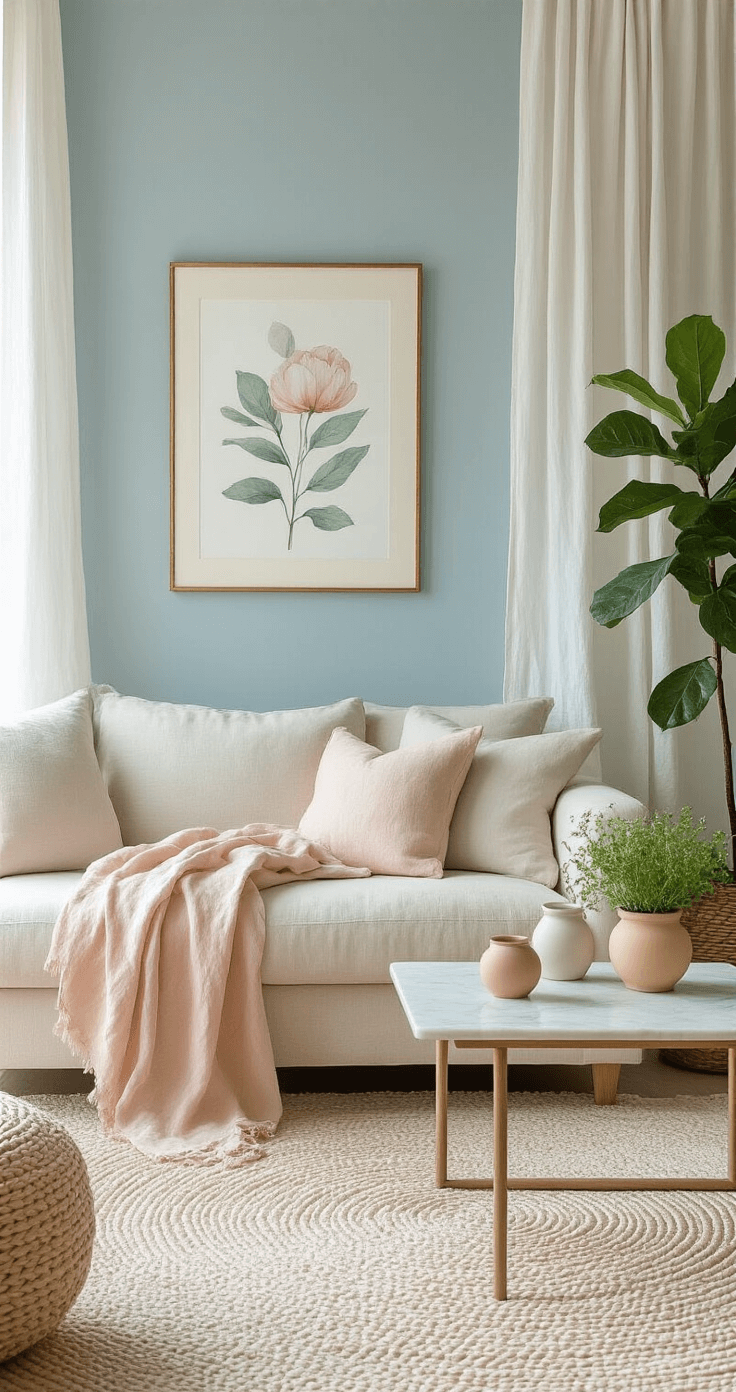
Light sky blues are another winner, especially when you pair them with warm materials like white oak, natural stone, and linen.
The contrast between cool blue and warm textures creates this beautiful tension that keeps your eye moving around the room.
The Bold Approach for People Who Actually Have Personality
Listen, if pastels make you want to take a nap, I feel you.
Some of us need more energy than “baby nursery chic” provides.
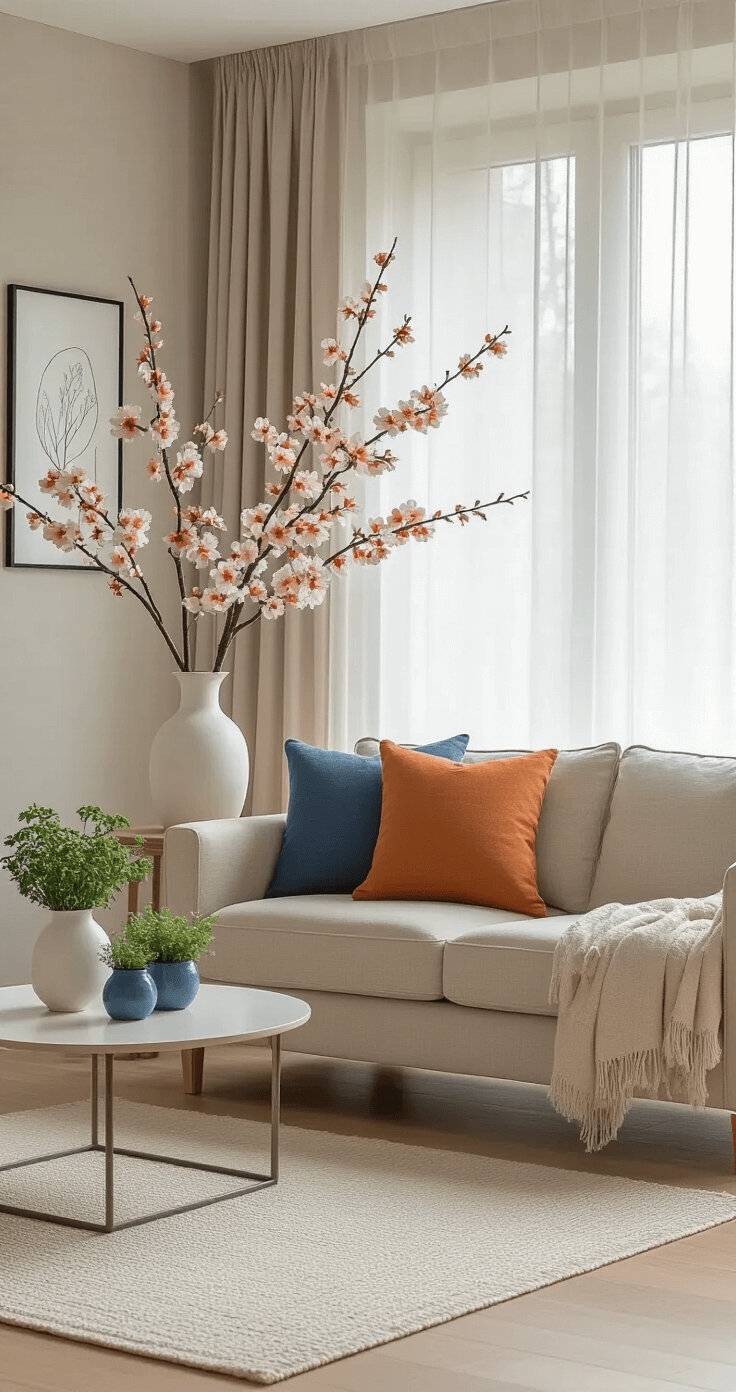
Enter the complementary color strategy.
Orange and blue are natural companions on the color wheel, and they create this vibrant spring vibe that feels alive without being chaotic.
I learned this the hard way after buying decorative throw pillows in random spring colors that clashed like reality TV stars.
Now I stick to complementary pairs, and my living room actually looks like a designer touched it instead of a tornado.
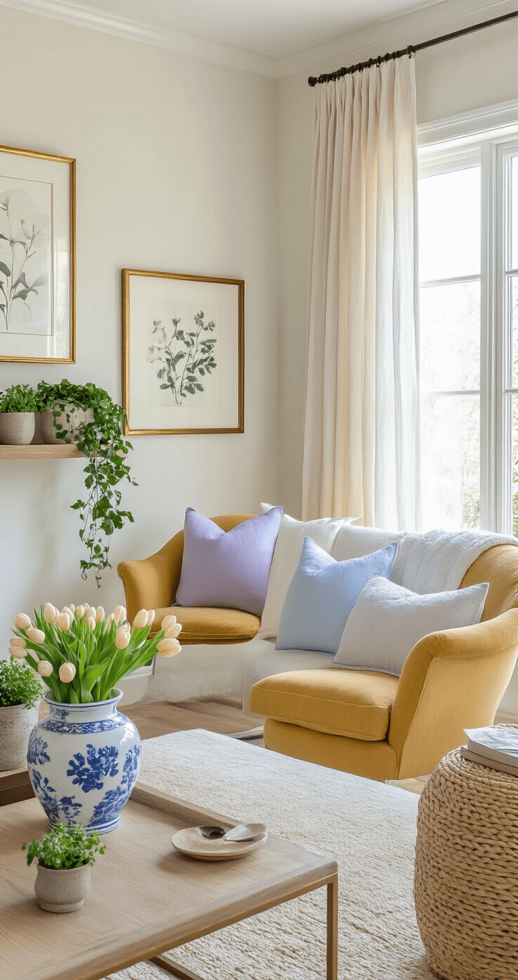
Marigold deserves its own moment here.
Pantone crowned it a fresh spring color, and honestly, they weren’t wrong.
This shade captures that feeling of longer daylight hours returning—that first moment when you realize it’s still light out at 7 PM and you feel like you’ve been given extra hours in your day.
A marigold accent chair or area rug can absolutely transform a neutral space into something that hums with sunny energy.

🏠 Steal This Look
- Paint Color: Benjamin Moore Soft Fern 2144-40
- Furniture: slipcovered linen sofa in a natural oatmeal tone with subtle gray undertones
- Lighting: oversized natural rattan pendant with warm brass hardware
- Materials: raw Belgian linen, unbleached cotton, weathered oak, hand-thrown ceramic, and matte terracotta with chalky finishes
I’ve walked into too many living rooms that feel like they apologized for existing—this approach lets your space breathe without whispering.
The Essential Spring Decor Elements That Don’t Look Cheap
Right, let’s talk about actual pieces.
Because theory is nice, but you need stuff to put in your living room.
Pillows: Your Secret Weapon
Vibrant pillows in spring patterns and colors are your best friend.
They’re:
- Affordable
- Easy to swap out seasonally
- Low commitment if you hate them
- Perfect for layering visual interest
I keep a rotation of spring throw pillows in my storage closet.
When March hits, out go the dark winter velvets, in come the light cotton florals and geometric patterns in spring tones.
The whole vibe shifts in literally 15 minutes.
The Blue and White Secret
Blue and white vases, jars, and planters are classic spring accents for a reason.
They work.
Every single time.
I have this collection of blue and white ginger jars on my mantel that I fill with different things throughout the year, but in spring, I stuff them with faux tulips or pussy willows.
Instant sophistication.
Zero effort.
Florals Without the Fuss
Look, real flowers are gorgeous.
They’re also expensive, high-maintenance, and they die approximately 4 days after you buy them.
Faux florals have come a long way from those tragic dusty roses your grandmother had.
Modern faux arrangements—especially tulips and cherry blossoms—look shockingly real.
I have a massive cherry blossom branch arrangement in my entryway that guests constantly try to smell because they think it’s real.
The satisfaction I get from that never gets old.
★ Steal This Look
- Paint Color: Farrow & Ball Skylight 205
- Furniture: slipcovered linen sofa in natural oatmeal
- Lighting: ceramic table lamp with blue glaze base and white linen drum shade
- Materials: washed Belgian linen, hand-thrown ceramic, unbleached cotton, weathered wood
I learned this the hard way after years of buying those $19.99 pillow packs that went flat by June—now I invest in down inserts and rotate covers from small makers I find at markets.
This post may contain affiliate links. Please see my disclosure policy for details.


