
Why Your Cabinet Color Choice Actually Matters
Contents
Look, I get it. You’re standing in your kitchen right now, staring at those dated oak cabinets or that builder-grade white that’s somehow both boring and yellowing at the same time. You want change, but you’re terrified of making the wrong choice.
Here’s the thing—your cabinets cover roughly 40% of your kitchen’s visual real estate. Get them wrong, and every morning coffee feels like a design disaster. Get them right, and suddenly you’re that friend whose kitchen everyone wants to hang out in.

The Earthy Green Revolution (And Why I’m Obsessed)
Sage, olive, and moss greens are absolutely dominating kitchens right now, and honestly, it’s about time.
I painted my own kitchen island in a soft sage last spring, and the number of people who’ve stopped mid-conversation to ask about it is ridiculous.
These aren’t your grandmother’s avocado green appliances—these are sophisticated, muted tones that whisper rather than scream.
Why Green Works
- Pairs beautifully with natural materials like wood and marble
- Makes your space feel connected to nature without being literal about it
- Adapts to different lighting throughout the day
- Works with both warm brass and cool chrome hardware
If you’re going green, invest in quality sage green paint that won’t fade or yellow over time. The cheap stuff will betray you within a year.

Warm Neutrals: The Safe Bet That Actually Isn’t Boring
I know what you’re thinking—”Great, more beige.”
But hear me out.
Creamy whites, soft taupes, warm beiges, and off-whites are having a completely different moment than they did five years ago.
These aren’t the stark, cold neutrals that made your kitchen feel like a laboratory.
These are warm, inviting tones that make bread baking and lazy Sunday mornings feel intentional.
I watched my sister transform her kitchen with warm cream cabinets, and the difference between that and her old cool-white cabinets was like switching from fluorescent to candlelight.
The Neutral Strategy
For upper cabinets: Stick with lighter, airier tones
For lower cabinets: You can go slightly deeper for grounding
For islands: This is where you can get adventurous
Pair these with brushed gold cabinet hardware to amplify that warm, expensive feel.
Deep Blues That Don’t Feel Like a Funeral
Navy, cobalt, and those gorgeous stormy blues are still going strong, and I’m not mad about it.
I’ve worked with enough homeowners to know that dark colors scare people.
“Won’t it make my kitchen feel small?” “Isn’t that too trendy?” “What if I hate it?”
Valid questions, all of them.
But here’s what I’ve learned: depth doesn’t equal darkness.
A rich navy cabinet paired with the right lighting and contrasting elements creates sophistication that white cabinets simply cannot match.
Making Dark Blues Work
- Use them on lower cabinets only if you’re nervous
- Balance with lighter countertops (white marble or light quartz)
- Ensure you have adequate lighting—both natural and artificial
- Consider a matte or satin finish rather than glossy
My friend went full navy in her galley kitchen, which everyone said would be a disaster.
She paired it with white subway tile, brass fixtures, and pendant lights with warm bulbs.
The result? Pure magic.
Nobody talks about how small her kitchen is anymore—they talk about how stunning it looks.

Going Dark: Charcoal, Black, and Rich Browns
Matte black cabinets are having an absolute moment, and I’m here for the drama.
This isn’t for the faint of heart, though.
Dark cabinets demand commitment—to cleaning (fingerprints are real), to lighting (you’ll need more than you think), and to your vision.
But get it right, and you’ve got a kitchen that looks like it belongs in Architectural Digest.
The Dark Cabinet Playbook
- Matte or satin finishes hide imperfections better than gloss
- Install under-cabinet lighting—non-negotiable
- Use contrasting grout on light tile backsplashes
- Embrace natural wood elements to prevent the space from feeling cold
I’ve seen charcoal cabinets paired with butcher block countertops that stopped me in my tracks.
The contrast between the deep, moody cabinets and warm wood created this incredible balance that felt both modern and cozy.
Grab some butcher block countertop oil if you’re going this route—maintaining that wood is crucial.

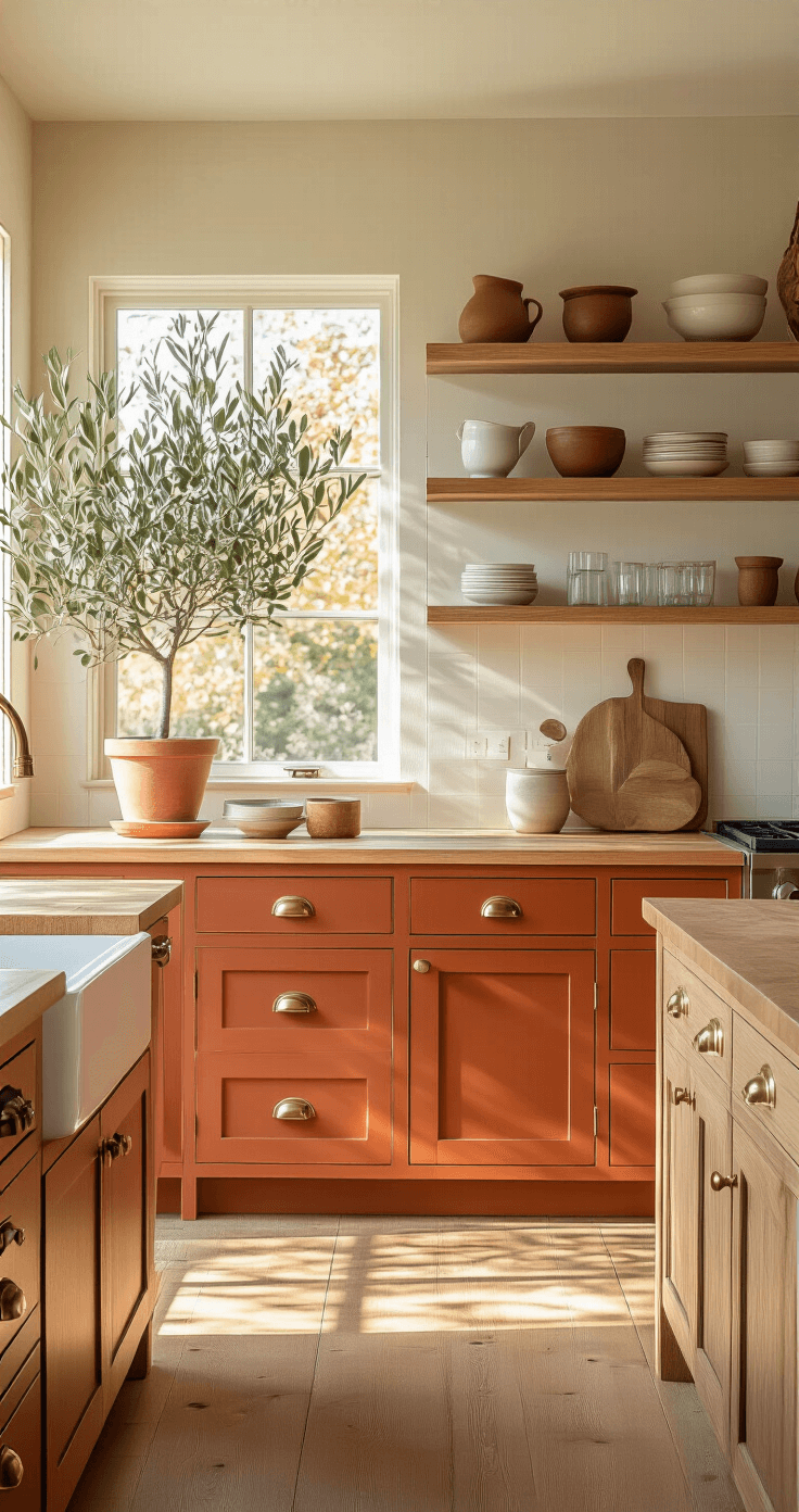
The Bold Move: Terracotta and Sunset Tones
Burnt orange, muted terracotta, burgundy, and those gorgeous sunset peachy-reds are creeping into kitchens, and honestly, it’s about time we got some personality back in here.
This is where I’ll lose some of you.
I get it—these colors feel risky.
But here’s my take: white and grey have dominated for so long that anything with actual pigment feels revolutionary.
Start small if you’re nervous.
How to Dip Your Toe Into Warm Tones
- Paint just your island in terracotta while keeping perimeter cabinets neutral
- Use these colors on lower cabinets only
- Pair with natural stone or concrete countertops
- Balance with plenty of natural wood tones
This post may contain affiliate links. Please see my disclosure policy for details.