
Why Your Bedroom Color Actually Matters More Than You Think
Contents
Here’s something most people don’t realize: your bedroom color directly affects your sleep quality and morning mood.
This isn’t just decorating fluff. Science backs this up.
Your brain responds to colors whether you consciously notice it or not. The right shade can lower your heart rate and help you drift off faster. The wrong one? You’ll be counting sheep until 3 AM wondering why you ever thought hot pink was a good idea.
🖼 Steal This Look
- Paint Color: Sherwin-Williams Sleepy Blue SW 6225
- Furniture: low-profile platform bed in warm white oak with rounded edges, paired with a single sculptural nightstand
- Lighting: dimmable linen drum pendant with brass hardware, hung low over bedside
- Materials: matte plaster walls, brushed cotton bedding, unglazed ceramic, raw linen curtains
I learned this the hard way after painting my own bedroom a vibrant terracotta that looked stunning by day but had me wired until midnight; swapping to a muted sage changed my sleep within a week.
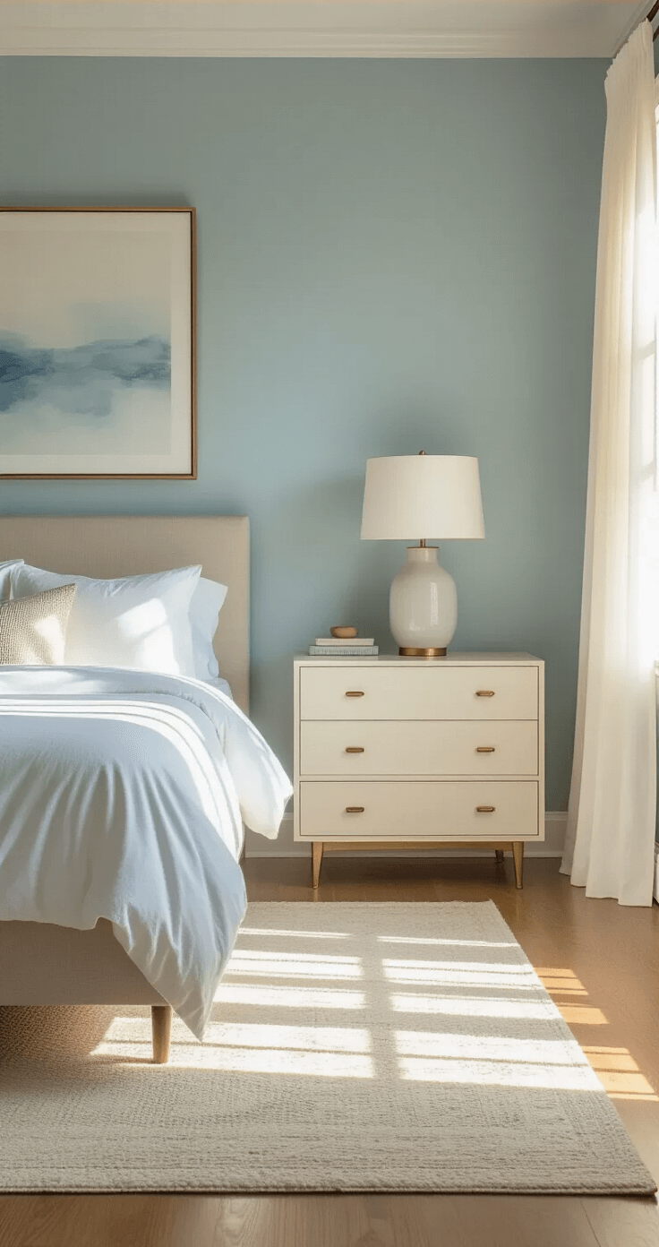
Cool Colors: Your Best Friends for Better Sleep
Blue: The Undisputed Sleep Champion
Blue is scientifically proven to be the most relaxing bedroom color, and there’s a reason high-end hotels use it constantly.
Your brain literally receives calming signals when you look at blue. It’s not placebo—it’s neuroscience.
The best blues for bedrooms:
- Soft sky blues that feel like a peaceful morning
- Dusty powder blues that whisper rather than shout
- Slate blues with just a hint of gray for sophistication
Pair your blue walls with crisp white bedding to create that fresh, hotel-like atmosphere you secretly crave every time you stumble into your bedroom after a long day.
Green: Nature’s Reset Button
Pale greens bring the outdoors in without making your bedroom look like a garden center exploded.
I painted my bedroom a soft sage three years ago, and I swear I sleep better. There’s something about waking up surrounded by that earthy, growth-oriented vibe that makes mornings less painful.
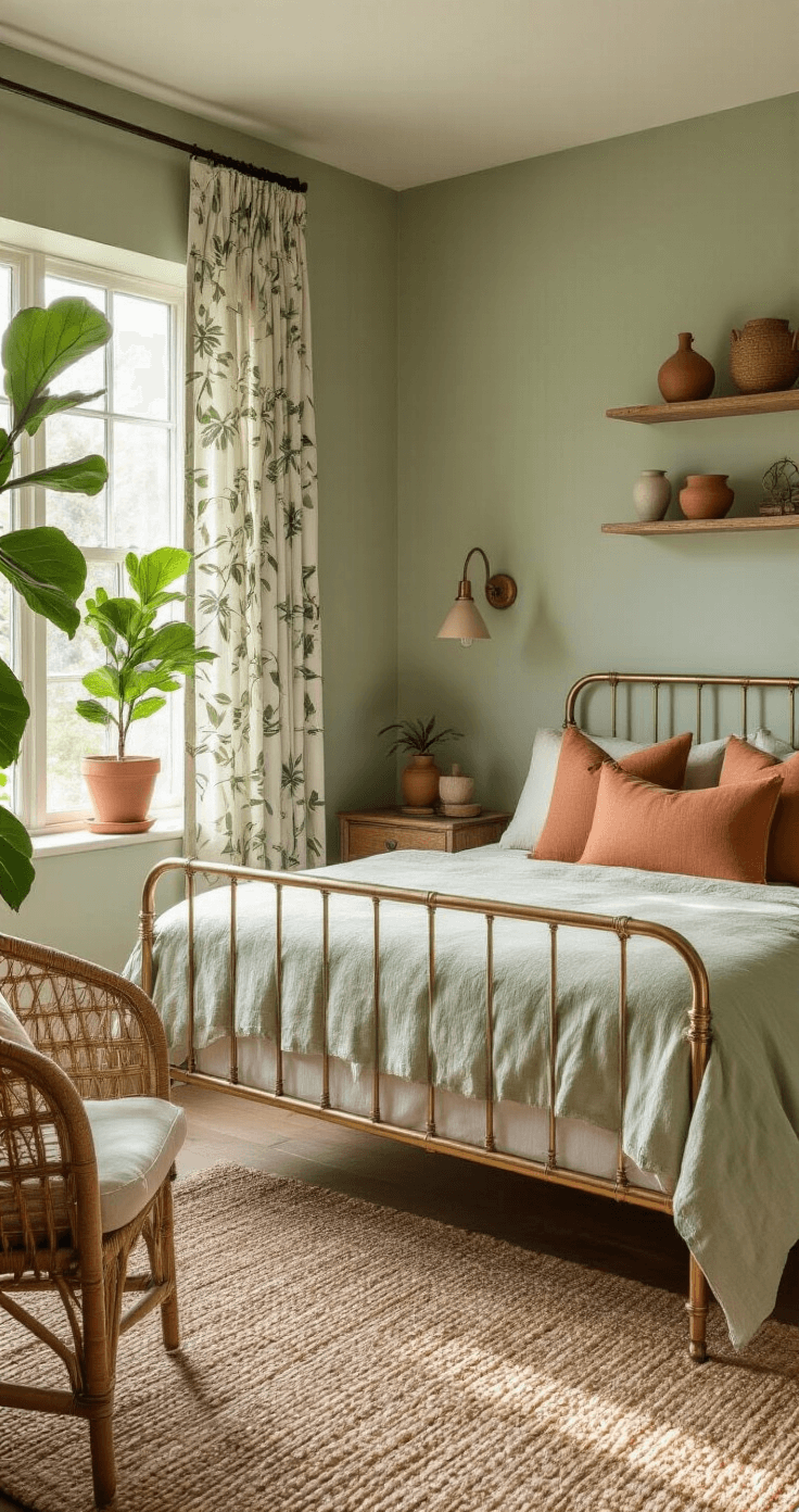
Green works because:
- It evokes renewal and fresh starts
- It feels both calming and subtly energizing
- It pairs beautifully with natural wood furniture
- It doesn’t show dirt as easily as white (trust me on this)
Try colors like Willowleaf or soft sage. Add some indoor plants on your nightstand, and suddenly you’ve got a mini wellness retreat.
Soft Whites: The Minimalist’s Dream
Soft whites create an open, ethereal feeling that makes even small bedrooms feel spacious.
Not stark white—that’s what dentist offices are for. I’m talking warm whites with subtle undertones.
Warm whites like Neutral Ground give you:
- A blank canvas for changing your decor mood
- Maximum light reflection
- That expensive, curated look design magazines love
- Easy coordination with literally anything
✎ Steal This Look
- Paint Color: Benjamin Moore Palladian Blue HC-144
- Furniture: upholstered platform bed with channel tufting in off-white linen
- Lighting: brushed brass swing-arm wall sconces with linen shades
- Materials: matte painted walls, natural linen, whitewashed oak, unglazed ceramic
I painted my own bedroom a dusty blue after years of fighting insomnia, and the difference in how quickly I drift off still surprises me—color genuinely rewires your evening experience.
Warm Tones: Cozy Comfort That Hugs You Awake
Soft Yellow: Sunshine Without the Alarm Clock
Soft yellows encourage happiness and optimism the moment you open your crusty morning eyes.
Not school bus yellow. Not highlighter yellow. Think pale buttercream or warm honey.
Yellows work brilliantly if:
- Your room gets limited natural light
- You struggle with morning grogginess
- You want energy without anxiety
- You’re decorating a guest room where people should feel welcomed
Pair yellow walls with textured throw blankets in cream or soft gray to balance the warmth.
Pastel Pink: Surprisingly Sophisticated
Pastel pinks provide warmth, softness, and a nurturing embrace without looking like a toddler’s bedroom.
Modern dusty pinks and art deco pinks have come a long way. They’re grown-up, subtle, and genuinely calming.
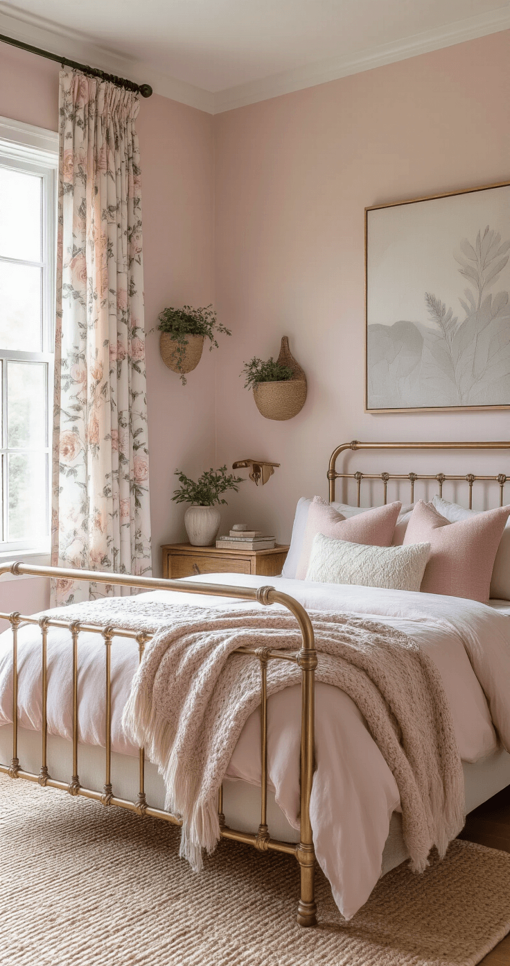
I was skeptical until I saw a friend’s bedroom in dusty rose. It felt like being wrapped in cashmere.
★ Steal This Look
- Paint Color: Farrow & Ball Dayroom Yellow W9
- Furniture: upholstered linen headboard in natural oatmeal with rounded corners
- Lighting: brass swing-arm wall sconce with linen shade
- Materials: raw Belgian linen, warm oak, brushed brass, hand-thrown ceramic
There’s something almost rebellious about choosing yellow for a bedroom in an era of gray everything—it signals you actually want to wake up happy, not just rested.
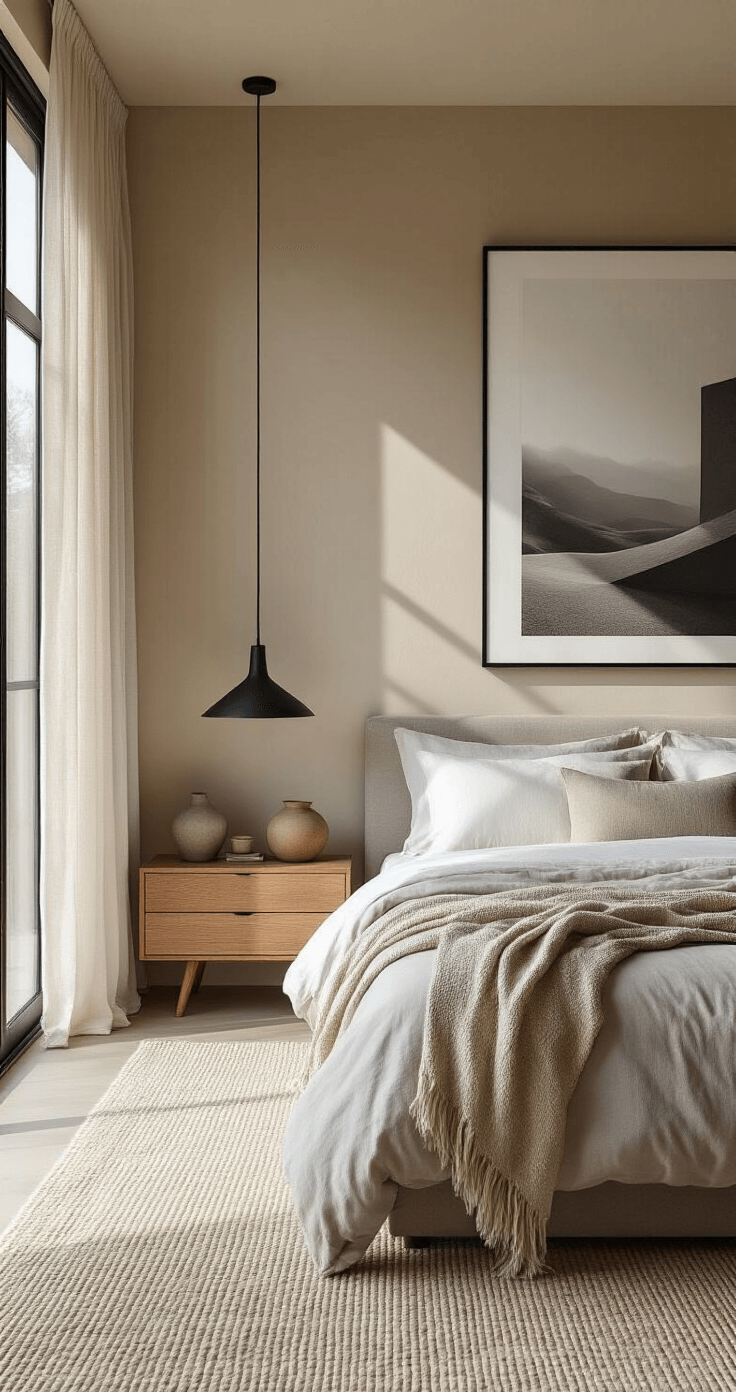
Neutral Tones: The Versatile Backbone of Great Design
Neutrals like beige, taupe, ivory, and light gray serve as sophisticated, calming backdrops that never go out of style.
Here’s why neutrals are secretly genius:
- They grow with your style evolution
- They increase resale value if you’re strategic
- They let your furniture and art be the stars
- They don’t require repainting when you get bored
Top neutral picks:
- Suede beige for warmth
- Planetary silver for modern vibes
- Antique tin for industrial-chic spaces
- Taupe for timeless sophistication
- Gingerbread latte for cozy comfort
Layer neutrals with decorative pillows in accent colors to add personality without commitment.
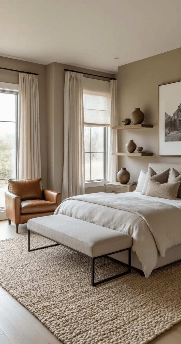
💡 Steal This Look
- Paint Color: Behr Suede Beige PPU4-06
- Furniture: upholstered platform bed in natural linen with clean lines, mid-century modern walnut nightstands with tapered legs
- Lighting: brass arc floor lamp with linen drum shade positioned beside reading nook
- Materials: raw Belgian linen, warm oak, brushed brass, chunky wool knit throws, unbleached cotton
This is the bedroom you retreat to after a chaotic day—the walls wrap around you like a soft blanket, and somehow your grandmother’s quilt and that splurge chair you bought last year finally coexist in peace.
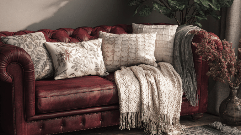
Colors to Avoid (Unless You Enjoy Never Sleeping)
Red, vibrant orange, dark purple, and black can disrupt relaxation and mess with your sleep quality.
I learned this the hard way.
My first apartment bedroom was painted deep burgundy because I thought it looked dramatic and romantic. Know what else is dramatic? Lying awake at midnight feeling inexplicably anxious in your own bedroom.
These colors:
- Increase heart rate
- Stimulate rather than soothe
- Make rooms feel smaller and darker
- Can trigger restlessness
Use them as small accents instead—a throw pillow here, artwork there—and you’ll get the visual interest without the sleep interference.
![]()
🎨 Steal This Look
- Paint Color: use Valspar brand. Match the ACTUAL wall color in the image. Format: Valspar ColorName CODE
- Furniture: low-profile platform bed in warm natural oak with rounded edges to soften the space
- Lighting: dimmable bedside wall sconces with linen shades for adjustable evening ambiance
- Materials: breathable linen bedding, raw cotton throws, matte ceramic vases, and light-washed wood accents
That burgundy bedroom taught me that what photographs beautifully for Instagram often lives miserably in real life, and I’ve never regretted prioritizing how a room feels over how it looks at golden hour.
This post may contain affiliate links. Please see my disclosure policy for details.