Modern Kitchen Cabinets: Everything You Need to Know Before Your 2026 Renovation
Contents
- Modern Kitchen Cabinets: Everything You Need to Know Before Your 2026 Renovation
- Why Curved Cabinets Are Stealing the Show
- Glass-Front Cabinets: Display Without the Disaster
- Shaker vs. Slab-Front: The Great Cabinet Door Debate
- Two-Tone Cabinets: How to Not Mess This Up
- Hardware That Makes or Breaks Your Cabinet
Modern kitchen cabinets are transforming how we think about kitchen design, and I’ve spent the last three months diving deep into what actually works versus what just looks good on Pinterest.
You’re probably staring at your outdated kitchen right now, wondering where to even start. Maybe your cabinets are stuck in 2010, or you’re drowning in clutter with nowhere to put anything. I get it—I was there two years ago, and the overwhelm nearly made me give up entirely.

💡 Steal This Look
- Paint Color: Sherwin-Williams Pure White SW 7005
- Furniture: floating kitchen island with waterfall quartz countertop
- Lighting: linear LED pendant with integrated dimming in matte black
- Materials: rift-sawn white oak veneer, brushed brass hardware, super-matte acrylic laminate
I learned this the hard way when my first renovation looked like a furniture store exploded—modern kitchens demand restraint because every element is visually exposed, so your mistakes have nowhere to hide.
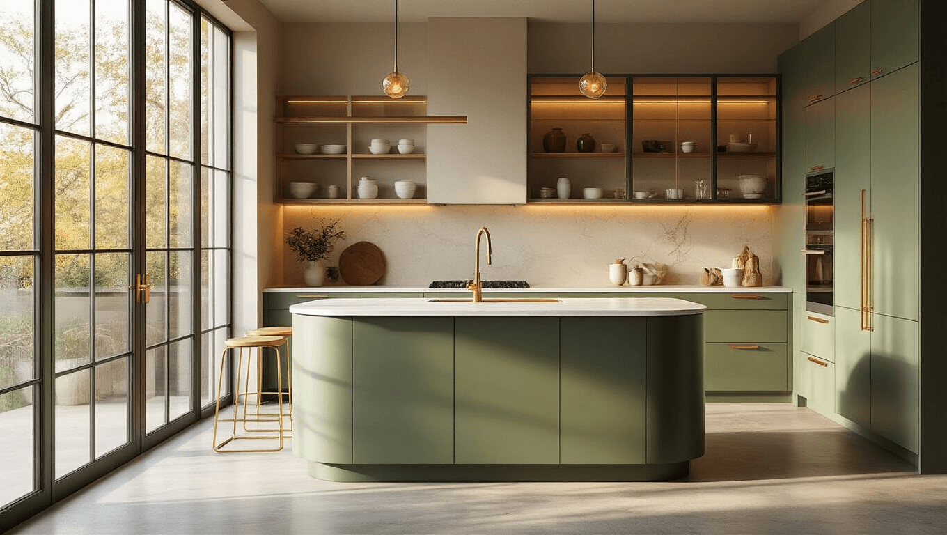
Why Curved Cabinets Are Stealing the Show
I’ll be honest—I thought curved cabinets were just another passing fad until I visited my sister’s newly renovated kitchen.
The difference hit me immediately. Her curved island didn’t just look softer and more inviting. It actually made the kitchen flow better because no one was bumping into sharp corners anymore.
Here’s what curved and fluid geometries bring to your kitchen:
- Smoother traffic patterns that make cooking with multiple people actually pleasant
- Natural gathering spots where people instinctively want to stand and chat
- A softer aesthetic that feels less institutional and more home-like
- Better flow in smaller kitchens where every inch of movement matters
The trick is not going overboard. One curved element—like an island or a peninsula—creates impact without looking like you’re trying too hard.
If you’re considering this style, pair it with curved cabinet hardware that echoes the gentle lines.
💡 Steal This Look
- Paint Color: Benjamin Moore White Dove OC-17
- Furniture: curved waterfall-edge kitchen island with integrated seating
- Lighting: sculptural pendant cluster with organic globe shapes in aged brass
- Materials: quartzite with soft veining, rift-sawn white oak, matte black iron hardware
There’s something almost magnetic about a curved kitchen island—I’ve watched guests gravitate toward it without prompting, coffee cups in hand, naturally forming a circle instead of lining up against a wall.
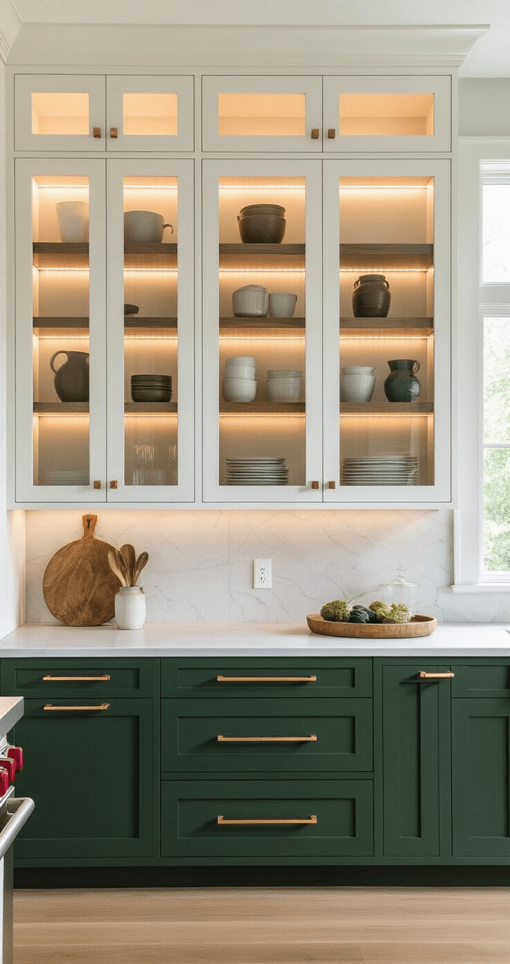
Glass-Front Cabinets: Display Without the Disaster
My mother always said glass cabinets meant you had to keep everything perfect. She was wrong, and I’m going to tell you why.
Mixed glass applications are the secret weapon here. You’re not installing clear glass on every cabinet door like it’s 1995.
Instead, you’re strategically combining:
- Clear glass for items you’re proud to display (nice dishes, colorful glassware)
- Textured or reed glass that shows shapes and colors but blurs the details
- Frosted sections that hide everyday chaos while still feeling open and light
- Tinted panels in bronze or grey that add depth and conceal imperfections
I installed reed glass on three upper cabinets in my kitchen last year. The visual rhythm it creates against solid doors is genuinely striking, and guests always comment on it.
The game-changer? Adding LED strip lights inside those glass cabinets. The ambient glow at night turns your kitchen into something that feels professionally designed.
Pro tip from my contractor friend Mike: Install dimmable LEDs so you can adjust the brightness for different times of day.
🏠 Steal This Look
- Paint Color: Farrow & Ball Ammonite 274
- Furniture: open shelving unit with integrated wine glass storage
- Lighting: adjustable LED strip lighting inside upper cabinets
- Materials: reed glass panels, brushed brass frame hardware, white oak interior shelving, ribbed glass for texture variation
I learned this the hard way after living with a full wall of clear glass cabinets for two years—my everyday mismatched mugs became a source of daily guilt until I swapped the center panels for reeded glass and finally felt at peace in my own kitchen.
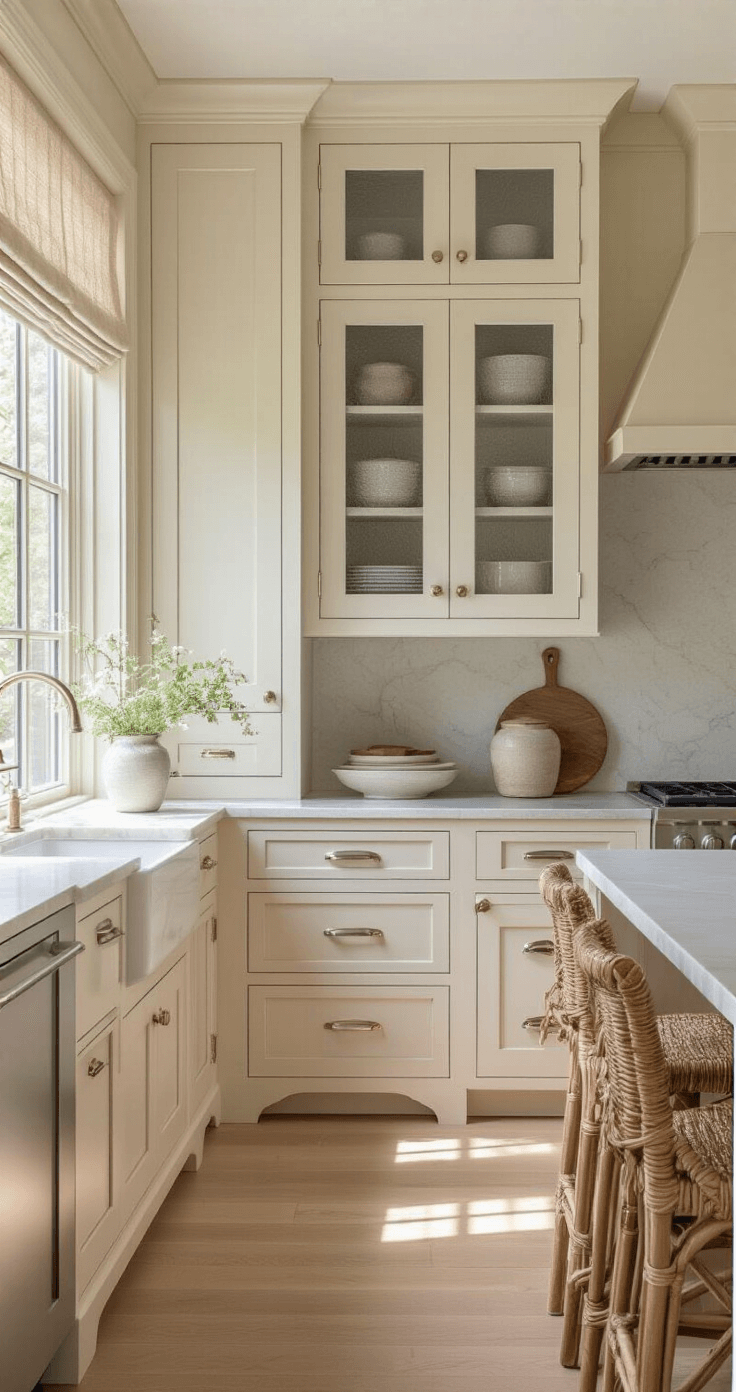
Shaker vs. Slab-Front: The Great Cabinet Door Debate
This is where people get stuck, and I’m going to make it simple.
Shaker cabinet doors feature that classic flat center panel with a frame. They’re timeless because they work in virtually any style kitchen—traditional, transitional, or modern.
I chose shaker style cabinet doors for my own kitchen because:
- They add subtle visual interest without screaming for attention
- They handle bold colors beautifully (I went with a moody sage green)
- They age well and won’t look dated in five years
- They’re easier to clean than ornate traditional doors
Slab-front cabinets are the sleeker, more minimalist option. Completely flat with no frame or detailing.
Choose slab-front when:
- You want a truly modern, streamlined look
- Your kitchen is small and you need visual simplicity
- You’re planning to use statement hardware as the main design element
- You’re pairing cabinets with busy countertops or backsplashes
The beauty of slab-front is that the hardware becomes the star of the show.

🏠 Steal This Look
- Paint Color: Behr Cracked Pepper PPU18-01
- Furniture: floating walnut kitchen island with waterfall edge
- Lighting: linear LED pendant with black metal housing over island
- Materials: quartzite countertops, brushed brass hardware, white oak open shelving
I agonized over this decision for three months, staring at samples propped against my old laminate cabinets while my contractor sighed heavily, and the moment I held that sage green shaker sample against the morning light, I finally understood why designers call this the workhorse of kitchen design—it just quiets the room.
Two-Tone Cabinets: How to Not Mess This Up
Two-tone kitchens are everywhere right now, and for good reason—they add dimension without chaos.
But I’ve seen this trend go horribly wrong. My neighbor did navy blue uppers with white lowers, and the kitchen feels top-heavy and dark.
The formula that actually works:
- Lighter colors on upper cabinets
- Deeper, richer colors on lower cabinets or islands
This grounds the space visually and doesn’t make your ceiling feel like it’s closing in.
Color Combinations I’ve Seen Work Beautifully:
For the base cabinets or island:
- Smoky jade green (sophisticated and works in both modern and traditional spaces)
- Rich navy blue paired with stone counters and brushed brass hardware
- Deep espresso brown for a moody, modern English vibe
- Burgundy for bold personalities who want something unexpected
For upper cabinets:
- Warm white or cream to keep things bright
- Light grey for a softer neutral
- Natural light wood stain for warmth
My kitchen has warm white uppers with a deep forest green island. The green cabinet paint I used required three coats, but the depth of color was worth every minute of extra work.
Word of warning: Get actual cabinet samples or paint large poster boards before committing. Cabinet colors look completely different under your specific lighting than they do in showrooms or on Instagram.
🏠 Steal This Look
- Paint Color: Valspar Smoky Jade 5007-3C
- Furniture: tapered leg kitchen island with open shelving base
- Lighting: linear LED pendant with brass accents over island
- Materials: honed Carrara marble, wire-brushed white oak, antiqued brass pulls
This is the kitchen trend I get the most panicked texts about—everyone loves the look on Pinterest but freezes at the paint store. The truth is, two-tone done right feels inevitable, like the kitchen was always meant to be this way.
Hardware That Makes or Breaks Your Cabinet
This post may contain affiliate links. Please see my disclosure policy for details.