
Spring Porch Decor That Actually Makes Your Neighbors Jealous (Without Breaking the Bank)
Contents
- Spring Porch Decor That Actually Makes Your Neighbors Jealous (Without Breaking the Bank)
- Why Your Porch Looks Sad (And How to Fix It)
- The Foundation: Start With What Actually Matters
- Step 1: Clear Everything Out
- Step 2: Layer Your Rugs Like a Designer
- The Wreath That Does All the Heavy Lifting
- Plants: Where Most People Waste Money
- The Real vs. Faux Plant Debate
- Color: The Secret Sauce Nobody Talks About
- Option 1: Classic Spring Pastels
- Option 2: Bold and Bright
- Option 3: Natural Neutrals
Spring porch decor transforms your home’s entrance from drab winter leftovers into a space that makes you smile every time you walk through the door.
I get it—you’re standing on your tired-looking porch right now, staring at that wreath that’s been hanging since November, wondering how the hell to make this space look like those gorgeous Pinterest photos without spending your entire paycheck.
Here’s the truth: you don’t need a designer budget or a degree in floral arranging.
You just need a plan.
Why Your Porch Looks Sad (And How to Fix It)
Most porches fail because we overthink them.
We pile on random decorations, buy whatever’s cute at Target, and end up with a cluttered mess that screams “I tried too hard” instead of “Welcome to my beautiful home.”
I’ve been there.
Three years ago, I spent $200 on spring decorations that looked amazing in the store but absolutely terrible on my actual porch.
The problem wasn’t the items themselves.
It was that I had no strategy, no color plan, and way too much stuff fighting for attention.

The Foundation: Start With What Actually Matters
Spring porch decor works when you build from the ground up—literally.
Here’s what I mean:
Step 1: Clear Everything Out
Take everything off your porch right now.
Yes, everything.
That old doormat, those planters from last year, the random watering can you forgot about—all of it goes.
Sweep thoroughly because you need to see your blank canvas.
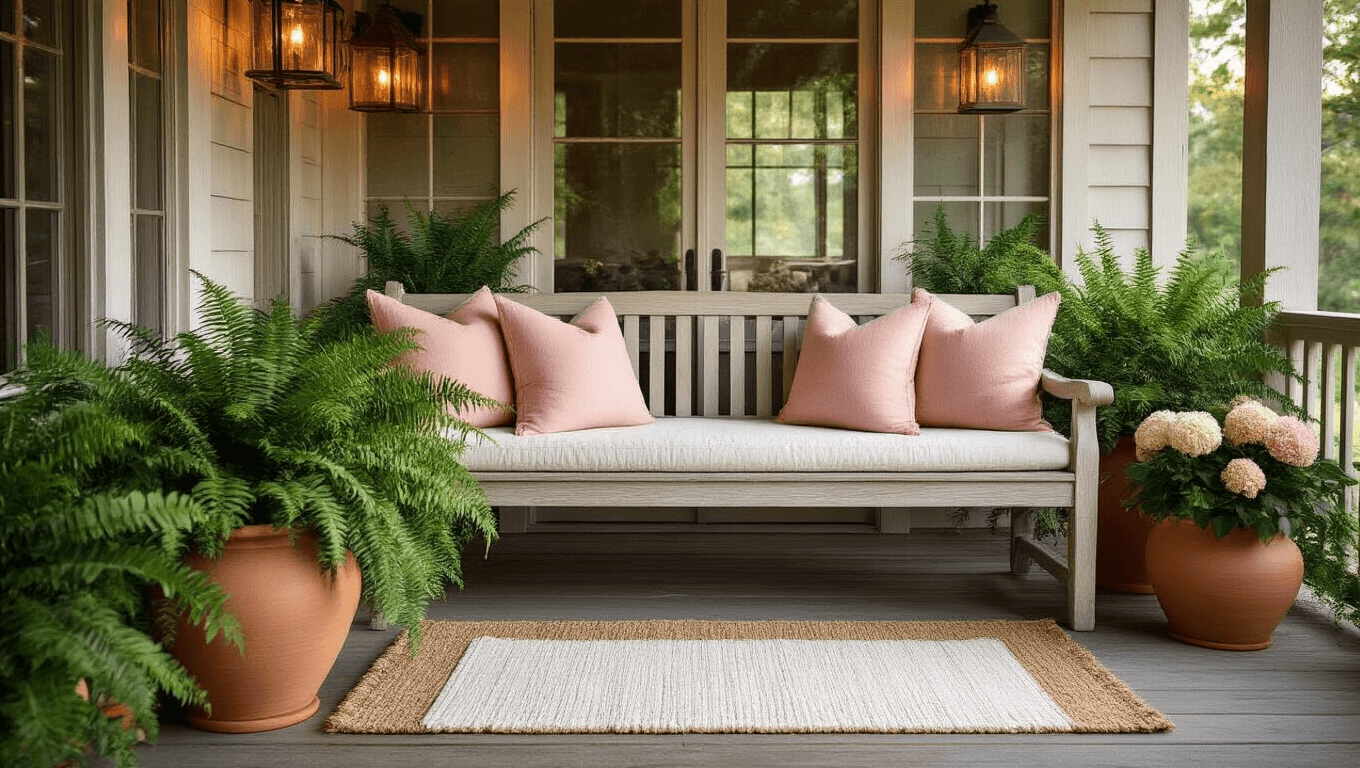
Step 2: Layer Your Rugs Like a Designer
This is where most people skip a crucial step.
A layered outdoor rug creates instant sophistication.
Here’s my formula:
- Bottom layer: neutral jute or sisal rug that covers most of your porch floor
- Top layer: a smaller, colorful welcome mat with spring colors
The contrast adds depth and makes your space look intentionally styled instead of slapped together.
I use a natural jute rug year-round and just swap the top mat seasonally—saves money and storage space.
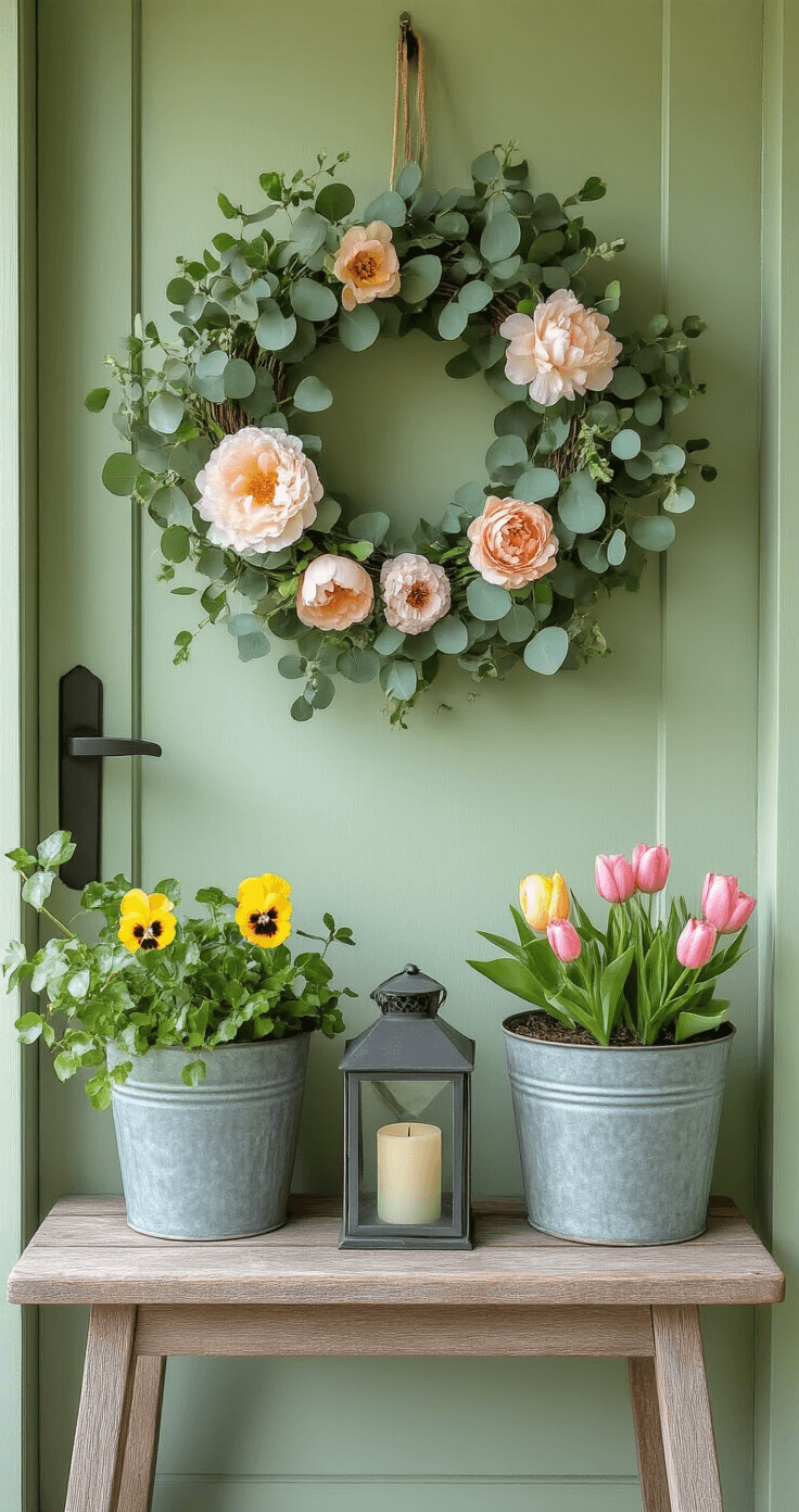
The Wreath That Does All the Heavy Lifting
Your front door is the focal point whether you like it or not.
A spring wreath signals to everyone that you’ve got your life together (even if you don’t).
Skip the pre-made wreaths that look like everyone else’s.
Instead, grab a grapevine base and build layers:
- Start with eucalyptus or fern stems as your greenery base
- Add larger statement flowers like hydrangeas or peonies
- Fill gaps with smaller blooms—tulips, daisies, or whatever makes you happy
- Keep it asymmetrical for a more natural, expensive look
I make mine on my kitchen table while watching TV.
Takes maybe 30 minutes, costs half what the fancy boutique versions cost, and looks completely custom.
Pro tip: Use floral wire instead of hot glue so you can rearrange elements if something looks off.
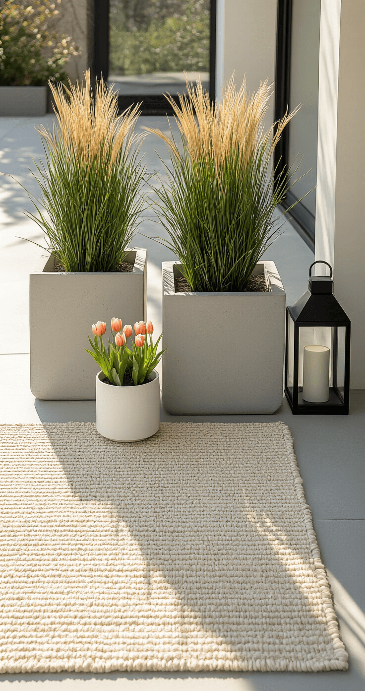
Plants: Where Most People Waste Money
Listen carefully: you don’t need two dozen perfectly matched planters.
You need strategic placement and varied heights.
My tried-and-true planter setup:
- Two large planters flanking your door with tall arrangements (think ferns or tall grasses)
- One medium statement planter on your porch steps or corner
- Small accent containers scattered thoughtfully—not randomly
I hit up thrift stores and flea markets for mismatched containers that I spray paint in my cohesive color palette.
An old galvanized bucket becomes a vintage-style planter with zero effort.
A chipped ceramic pot looks intentionally rustic instead of forgotten.
The Real vs. Faux Plant Debate
I use both, and here’s why:
Real plants for:
- Areas where you’ll water them consistently
- High-visibility spots where people get close
- True plant lovers who find joy in maintenance
Faux plants for:
- Spots you forget to water
- Full sun areas that kill everything
- Background elements where texture matters more than botanical accuracy
No shame in high-quality artificial greenery.
I’ve had guests compliment my “beautiful ferns” that I’ve literally never watered once.

Color: The Secret Sauce Nobody Talks About
This is where amateur decorators crash and burn.
They see a cute yellow pillow, a coral planter, a teal sign, and some purple flowers—all individually beautiful—and throw them together.
The result looks like a craft store exploded.
Pick your palette and stick to it ruthlessly:
Option 1: Classic Spring Pastels
- Soft pink
- Light yellow
- Cream/white
- Gray-green
Option 2: Bold and Bright
- Sunny yellow
- Crisp white
- Fresh green
- Navy accent
Option 3: Natural Neutrals
- Whites
- Greens (multiple shades)
- Natural wood tones
- One pop color (I use blush pink)
I personally run
This post may contain affiliate links. Please see my disclosure policy for details.


